The NabuOS app has a new look
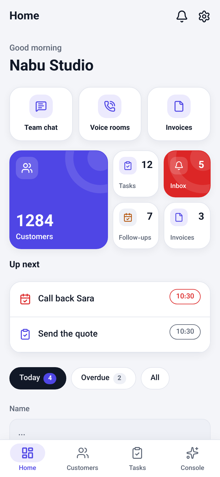
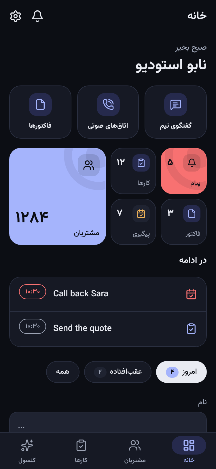
The phone app has been redesigned: the brand's indigo, light headers that sit on the page, cards that float on soft shadows, a tab bar with the chosen tab in a pill, and buttons and tiles that give under your finger. The dark mode is new too.
Product update 2 min read
What changed
The NabuOS app on Android and iPhone has been redesigned from its colours up. Everything you could do before is where it was; it just looks and feels more modern.
- The brand's own colour. The accent is now the indigo of the NabuOS logo, instead of the red band every screen used to wear.
- Light headers. A screen's title sits on the page itself, so the screen reads as one sheet rather than a red bar over a grey page.
- Cards that float. Lists, the quick links and the home board's tiles are rounded cards on soft shadows; each glyph sits in a tinted well.
- A new tab bar. The chosen tab's icon sits in a pill, and switching tabs gives a small tick under your finger.
- Buttons and tiles you can feel. They sink slightly when pressed and spring back; the main button of a screen gives a light tap.
- Home greets you with "Good morning", "Good afternoon" or "Good evening" above the business's name.
- Calmer forms. Fields are soft-filled and ring in the accent while you type; sheets rise with rounded corners and a grab handle.
- A deeper dark mode. A deep blue-black page with cards one tone lighter, so they stand out without shadows.
- Loading is easier on the eye. Lists that are still loading breathe gently instead of standing still.
How to use it
- Update NabuOS to version 1.5.0 from the NabuOS download page (or the store, when it reaches you).
- Open the app. To try the dark look, go to Settings and choose Dark under the appearance options.
Good to know
- Nothing moved: the same tabs, screens and buttons, in the same places.
- Every colour pair still reads at the WCAG AA contrast level in both the light and the dark look.
- Persian and Arabic keep their right-to-left layout and the Vazirmatn typeface.